PowerPoint is no longer the automatic choice for business presentations. As companies move toward remote work, brand-driven communication, and data-informed storytelling, presentation tools have evolved to offer smarter collaboration, better design control, and more engaging delivery formats.
Here are 10 of the best PowerPoint alternatives for business presentations, analyzed through the lens of real-world business needs, not marketing hype.
Google Slides has turned into the “Slack of slides” for many companies: always-on, link-based, and built for people who live in Docs, Sheets, and Gmail all day.
● Native to Google Workspace, so you pull numbers straight from Sheets and context from Docs without exporting files.
● Real-time co-editing with threaded comments and suggestion mode; no more “final_v7_really_final.pptx”.
● Gemini in Slides can now draft slides from Drive/Gmail content and summarise long text blocks into bullets.
● Zero extra cost if you already pay for Workspace; IT doesn’t need to justify another SaaS line item.
● Works in any browser and on low-end laptops, which matters for large, mixed-device workforces.
● Excellent real-time collaboration and version history.
● Easy permissioning and link-based sharing for internal and client decks.
● Strong template ecosystem through Workspace add-ons and third-party libraries.
● Visual polish lags behind Canva/Keynote unless you have a designer on the team.
● Native animations and transitions are basic compared to desktop tools.
● Companies already standardized on Google Workspace that care more about collaboration and speed than motion graphics or “TED-talk” level visual drama.
In many marketing and startup teams, presentations are treated like mini brand campaigns; Canva leans into that by letting non-designers ship “agency-looking” decks quickly.
● Massive template library across pitch decks, marketing reports, town halls, one-pagers, and social variants.
● Brand kits (logo, palettes, typography) to lock visual identity across decks and social graphics.
● Built‑in charts, basic dashboards, and stock media so you rarely have to leave the tool.
● A marketing coordinator can build a board-ready deck without opening Photoshop or Figma.
● Same environment for slides, LinkedIn carousels, ad creatives, and print collateral enables true “single source” brand control.
● Best-in-class template breadth and stock asset depth at its price point.
● Very low learning curve; ideal for large, non-technical teams.
● Easy to maintain multi-brand workspaces for agencies and holding groups.
● Heavy reliance on templates means many decks are recognisably “Canva” unless strongly customised.
● Collaboration is solid, but not as fluid or fine-grained as Slides or Pitch for big document-driven teams.
Best for
● Marketing, sales enablement, and agency decks where design polish and cross-channel reuse matter as much as the content itself.
Prezi’s zoomable canvas isn’t a gimmick when used well; it’s a structural advantage for conversations where you don’t know in advance which threads the client will pull.
● Non-linear canvas where topics and subtopics live spatially instead of frame-by-frame.
● Zoom transitions that let you go from “market landscape view” into “feature detail view” fluidly.
● Newer AI-assisted structuring and design nudges to reduce the initial blank-canvas shock.
● Sales engineers and consultants can pivot to whatever the buyer cares about without “jumping to slide 47”.
● Trainers and educators can show systems thinking—processes, org structures, architectures—more intuitively than on linear slides.
● Very high perceived production value when used in executive or investor meetings.
● Encourages narrative thinking instead of “bullet dumping”.
● Meaningful learning curve; non-designers can create motion-sick decks by overusing zoom.
● Not ideal for dense, regulatory, or tabular content (financial packs, policy decks).
● Customer workshops, solution demos, training sessions, and visionary pitches where interactivity and narrative flexibility trump printability.
Beautiful.ai’s value proposition is blunt: “Stop fussing with boxes; tell us what you’re saying and we’ll make it look like your design team touched it.”
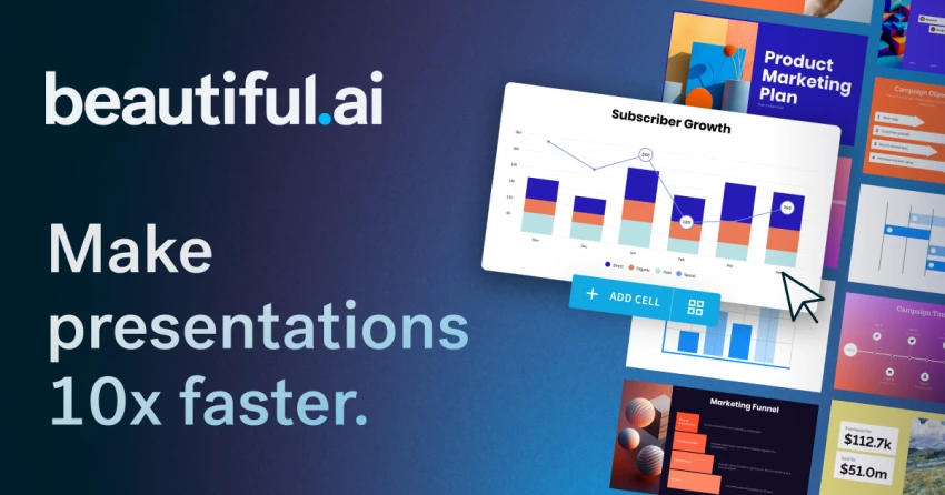
● AI-driven “smart slides” that auto-adjust layout as you add or remove bullets, icons, or charts.
● Brand control: enforce colours, fonts, and logo placement so every deck looks on-brand by default.
● Export to PowerPoint/PDF for organisations that still require .pptx in formal workflows.
● Directors and VPs can go from outline to board-ready deck in a single sitting without involving designers.
● Central brand team sets guardrails once instead of fixing every ugly slide after the fact.
● Consistency: it’s hard to create a truly ugly slide; spacing and hierarchy are handled automatically.
● Huge time savings for recurring formats (QBRs, MBRs, product updates).
● Layout freedom is intentionally constrained; creative teams may feel “boxed in”.
● Complex data stories still benefit from bespoke design in Visme or a BI tool.
● Mid–large organisations with strict brand standards and time-poor leaders who need to ship a lot of internal and stakeholder decks.
Pitch feels like it was built by founders who used GitHub and Figma and wondered why slides were still stuck in 2003.
● Board-style workspaces where decks have owners, statuses, and due dates, not just filenames.
● Strong versioning and slide-level assignments, so a multi-country sales deck can be updated in parallel without collisions.
● Engagement analytics on shared links: time per slide, completion rates, and drop-off points.
● Growth, sales, and fundraising teams can treat presentations like campaigns: test, measure, and iterate based on viewer behaviour.
● The product feels familiar to teams already using modern SaaS (Notion, Linear, Figma) rather than legacy office software.
● Collaboration layer is far richer than traditional “co-editing”; it has actual workflow thinking built in.
● Analytics make it obvious which customer/VC decks are actually being read and where people get stuck.
● Price per seat is higher than generic tools; makes most sense when you actually use the analytics.
● Template ecosystem is narrower than Canva/Slides; you’re trading variety for structure.
● Startups and revenue teams who want a living, optimised master deck rather than dozens of one-off PowerPoint files.
Visme sits between “presentation tool” and “data-storytelling platform”; it’s popular with teams that don’t want to jump into full BI but can’t afford flat screenshots either.
● Large library of charts, maps, and data widgets with more styling options than PowerPoint’s default charts.
● Interactive elements (hover states, clickable hotspots, simple quizzes) for turning decks into explorable experiences.
● Multiple export modes—static, video, or interactive web embeds—for sharing beyond the meeting room.
● Analysts and consultants can keep their analytics in-house instead of outsourcing “visualisation work” to the design team.
● You can use one platform for client-facing reports, pitch decks, infographics, and dashboards.
● Strong data visualisation and interactivity relative to typical presentation tools.
● Good balance between templates and deep chart customisation.
● Overkill for simple status decks; ROI appears when you’re doing repeated data storytelling.
● Feature density means onboarding non-technical stakeholders takes some hand-holding.
● Agencies, consulting shops, PMOs, and analytics teams that ship recurring report-style presentations to execs and clients.
Slidebean doesn’t try to be your “everything” presentation tool; it is unapologetically optimised for one job—raising money.
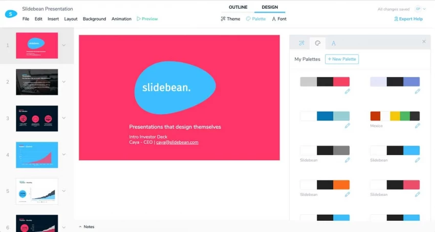
● Pre-built deck structures tuned to investor expectations (Problem, Solution, Market, Traction, etc.).
● AI and template guidance that push you toward metrics, evidence, and narrative investors actually care about.
● Built‑in viewer analytics for tracking which investors opened what and where they dropped off.
● Early-stage founders get a scaffolding that prevents classic pitch mistakes (too much product, not enough market/traction).
● Small teams don’t have to hire design help just to reach a credible visual baseline for their deck.
● Very fast path from messy Notion doc to VC-sane deck.
● Templates encapsulate hard-won lessons about what investors look for slide-by-slide.
● Beyond fundraising, many teams go back to Slides/Canva; it’s not aimed at all-hands or training.
● Visual style is opinionated; custom brand experiences may need additional design work.
● Pre-seed to Series B startups that want to minimise time spent on deck structure and maximise time spent on their numbers and story.
Keynote is still the “secret weapon” for Apple-heavy exec teams and speakers: it produces the kind of motion and polish audiences subconsciously compare everything else against.
● High-quality transitions and animations (especially Magic Move) that feel more like film editing than slide transitions.
● Tight integration with macOS and iOS, including iCloud sync and iPhone-as-remote out of the box.
● Mature video export for publishing keynote-style talks after live events.
● Product and design-led companies can match the visual standard set by tech conferences and Apple keynotes without custom motion graphics work.
● Offline performance is rock solid, which matters in corporate venues with flaky Wi‑Fi.
● Top-tier visual polish if you invest in learning its animation model.
● Free for Apple users, which lowers friction in Mac-centric orgs.
● Windows users are effectively locked out of collaborative editing.
● No native engagement analytics or SaaS-style workflow features.
● Executive keynotes, product launches, investor days, and design-led companies that primarily work on Macs.
Zoho Show is less about “beating PowerPoint on features” and more about being the presentation front-end for organisations already living inside Zoho CRM, Projects, and Books.
● Native integration with Zoho apps, especially CRM and Sheets, so sales and ops decks can pull live numbers.
● Real-time co-editing plus permissioning integrated with Zoho’s user management.
● Web-based editor with a conventional slide paradigm, making migration from PowerPoint straightforward.
● For a Zoho-first org, it reduces tool sprawl: presentations, docs, CRM data, and storage all live in one ecosystem.
● IT can standardise on one vendor for billing, support, and compliance.
● Strong value if you already license Zoho Workplace/CRM.
● Reasonable feature coverage for most internal and client decks.
● Outside the Zoho ecosystem it’s rarely the “best” choice; integrations and UX are tuned for existing Zoho customers.
● Design depth and motion options lag behind Canva, Keynote, and Prezi.
● Sales, support, and ops teams in Zoho-centric organisations that want live, always-current numbers in their decks without CSV gymnastics.
Mentimeter flips the usual success measure: instead of “Did they download the deck?”, the question becomes “Did they actively respond?”.
● Live polls, quizzes, ranking questions, and word clouds embedded inside your presentation flow.
● Audience participation via phones (no app install), useful for hybrid and auditorium settings.
● Post-session analytics: participation rates, question-level responses, and exportable datasets for follow-up analysis.
● L&D and HR teams running training, town halls, or all‑hands can surface sentiment and understanding in real time instead of assuming silence = agreement.
● Consultants and product teams can turn “update meetings” into live research sessions.
● Engagement lift is immediate and very visible; even resistant audiences tend to interact with quick polls.
● Data captured can feed back into content, roadmap, or policy decisions.
● Not a full replacement for a slide creator; usually paired with Slides/PowerPoint/Keynote.
● Requires reliable connectivity and a bit of facilitation skill to avoid slowing the session down.
● Training, workshops, company meetings, and conferences where interaction and sentiment data are more valuable than perfect slide aesthetics.
PowerPoint is no longer the only strong option for business presentations. Tools like
● Google Slides and Zoho Show work best for teams that prioritize collaboration and cloud access.
● Pitch and Beautiful.ai are ideal for creating clean, modern slides quickly with minimal design effort.
● Keynote delivers high-quality visuals for Mac users,
● Canva and Visme offer flexible design features for branding and data-driven content.
● For more dynamic storytelling, Prezi stands out.
Choosing the right alternative depends on whether your focus is speed, design, collaboration, or visual impact.

YouTube Shorts has shifted from a side experiment to one of the fastest ways to...
Samuel Osei1 day ago
Digital advertising has become brutally competitive: users scroll faster, acquis...
Samuel Osei4 days ago
AI image generators have shifted from experimental toys to core creative tools....
Peter Woods5 days ago

AI-powered image editors are now central to modern content creation, marketing,...
Alexander Hughes6 days ago

AI text-to-speech (TTS) has evolved from robotic audio to almost human‑sounding...
Samuel Osei1 week ago
IntroductionGraphic design is no longer limited to people who know Photoshop sho...
Funke Ogunleye1 week ago
Discussion