I’ve spent enough hours wandering through thesindi.com to know it almost like a regular hangout spot: the kind of place you drop into for a quick explanation on loans, stumble into a travel tip, and somehow end up reading about user experience or car care. This isn’t a cold SEO audit; this is a ground‑level look at what The Sindi actually feels like when you live in it as a reader.
Stripped of buzzwords, Thesindi.com is a multi‑niche information hub built for people who want answers in plain English, not in dense PDFs or PhD language. You’ll see it touch almost everything: money, health, travel, culture, fashion, tech, education, law, even the odd sports or automotive piece.
To give you a quick snapshot of how the site is shaped, here’s the kind of mental table I carry in my head when I think of it:
| Aspect | How it actually looks from inside the site |
| Core identity | Multi‑niche content platform, part blog, part guide |
| Language | English, very simple, beginner‑friendly |
| Structure | WordPress news/blog layout with category navigation |
| Access | Completely free, ad‑supported |
| Tone | Conversational, non‑technical, “friend explaining” |
| Quality band | Medium: useful for basics, weak for deep research |
If you’re expecting a polished media house with a newsroom and editorial masthead, that’s not what this is. Think more: a constantly updated, multi‑topic handbook written for people who’d rather not wrestle with jargon.
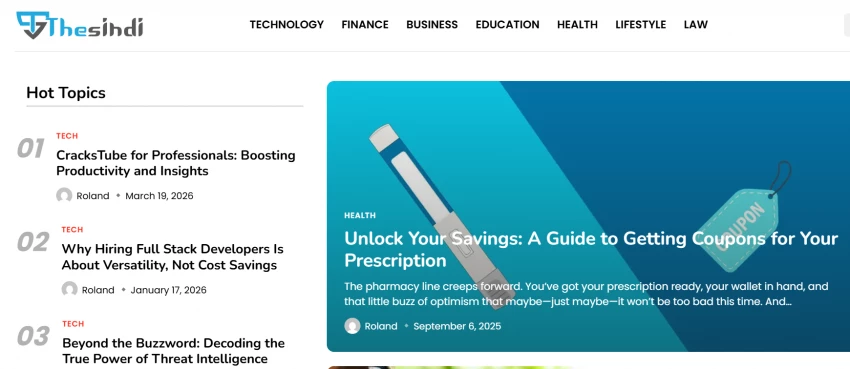
Thesindi.com doesn’t live in one niche. It sprawls.
Across the top navigation and archives, the main rooms of this house look roughly like:
● Finance / Business & Finance
● Health & Wellness
● Lifestyle / Travel / Culture / Fashion
● Technology
● Education
● Law
● Plus scattered sections like sports, automotive, social media, etc.
You notice the pattern only after spending time across pages: almost every big life bucket gets at least some coverage. One moment you’re reading about loan eligibility in India; two clicks later you’re in an article about travel safety tips, then a basic piece on new technologies for beginners.
| Section | What you typically get there |
| Finance / Business & Finance | Intros to loans, savings, budgeting, taxes, “how this scheme works” guides |
| Health & Wellness | Everyday health habits, basic wellness tips, fitness‑adjacent content |
| Lifestyle / Travel / Fashion | Home, travel, simple fashion ideas, general life hacks |
| Technology | New tech explained simply, basic tool/app guides, trends decoded for beginners |
| Education | Study tips, schooling/college guidance, learning and productivity themes |
| Law and related | Very basic rights/rules explanations for everyday scenarios |
| Other niches | Sports snippets, automotive basics, social media tips, assorted topics |
From the inside, this breadth feels both reassuring and dangerous. Reassuring, because you can genuinely wander a lot of life with one site. Dangerous, because when you try to be everywhere, it’s hard to be deep anywhere.
Here’s the part that defines the experience: the writing is almost aggressively simple.
Paragraphs are short. Sentences are plain. The structure is predictable in a good way: a straightforward headline, a quick intro, then subheadings that slice the topic into chunks—what it is, why it matters, how it works, pros, cons, maybe a closing note.
● The article assumes you know almost nothing about the topic—and that’s a strength for beginners.
● Jargon is either avoided or quickly translated into everyday language.
● You rarely see long theoretical sections; the pieces try to stay practical.
Where does this put The Sindi on a content spectrum? Something like this:
| Dimension | Where Thesindi.com sits |
| Readability | Very high: easy, conversational, skimmable |
| Depth | Low to medium: summary‑level, not expert‑level |
| Original insight | Limited: more explainers than unique perspectives |
| Voice | Friendly but generic; not personality‑driven |
If you come in exhausted after a long day and just want someone to “explain like I’m 15” what a particular loan, policy, or tech term means, this style works remarkably well. If you’re hunting for charts, citations, and nuanced analysis, you’ll hit the ceiling quickly.
Let’s talk about the part most users don’t see at first glance: the “who’s behind this” and “how much can I trust it” questions.
After bouncing around the site, a few things become obvious:
● It behaves like a legit content platform: standard legal pages (Privacy Policy, Disclaimer, Terms & Conditions, DMCA) are there; the site structure is consistent; there’s no obvious scammy behavior.
● It feels like a small, independent operation rather than a big media group. You don’t see a clear editorial team page or a loud brand personality.
● Articles often lack named expert authors, citations to primary sources, or explicit data references inside the content.
| Trust factor | What you see in practice |
| Basic safety | Normal, ad‑supported content site, no scam vibes |
| Ownership clarity | Vague; no detailed “who we are” front and center |
| Editorial transparency | Limited; no obvious editorial board or masthead |
| Source usage | Mostly implied; rarely deep citations or datasets |
| Overall reliability | Fine for orientation; not enough for final decisions |
From the insider reader point of view, this leads to a simple rule of thumb:
Thesindi is good enough to help you understand what something is. It is not strong enough, in its current form, to be the only source you use before you move your money, your health, or your legal decisions.
If you keep that boundary intact, the site serves you. If you forget it, you’re asking a beginner‑friendly explainer hub to behave like a government portal or a medical journal, and that’s not what it is built to be.
Thesindi is not a place where design steals the show—and that might be a good thing.
You get:
● A familiar, news‑style layout: logo, main categories across the top, content blocks below.
● Archive pages that go back a long way, which tells you this isn’t a weekend side project that got abandoned after five posts.
● Fast, light pages by modern standards—no overly heavy scripts, no endless “subscribe” overlays fighting for your attention.
If I had to score the UX for a normal user, it would roughly land like this:
| UX element | My Experience |
| Navigation | Clear: category links and archives are easy to follow |
| Mobile reading | Comfortable: short paragraphs, simple layout |
| Distractions | Moderate: typical ads, but not wildly intrusive |
| Findability | Good via search engines, basic internal linking |
| “Feel” | Functional, not flashy; more handbook than magazine |
The result is a site that doesn’t make you work very hard. You won’t remember its design, but you probably won’t complain about it either—and for a multi‑niche info site, that’s often enough.
Spend enough time on Thesindi and you start seeing the pattern behind the content.
The headlines are search‑shaped. The topics follow what normal people type into search bars. The layout supports scanning. You can almost hear the SEO playbook in the background.
In essence:
● Thesindi is tuned to catch long‑tail searches—“how to do X,” “what is Y,” “best way to Z”—across finance, health, lifestyle and tech.
● It uses volume and breadth to build reach: many articles, many niches, lots of entry points.
● The monetization is classic: ads, potential affiliate hooks, breathing room for future sponsored content.
| Business dimension | Where it stands today |
| Revenue model | Ads first, potential affiliates/sponsors next |
| Traffic level | Modest; not a giant media engine (yet) |
| Content strategy | Volume + breadth, SEO‑driven |
| Brand strength | Low to medium; not a household name |
| Ambition ceiling | Depends on if it upgrades depth and trust |
As someone who has walked its corridors, I’d say this: the mechanics are in place for a much stronger brand than it is today. But mechanics alone don’t make a great publication. The missing ingredients live in content depth, author credibility and editorial focus.
Let’s be brutally clear.
● You’re new to a topic and just want to stop feeling clueless.
● You’re a student, a young professional, a parent or a casual reader who wants “quick clarity first, deep research later.”
● You’re browsing for everyday advice on money, lifestyle, travel, health habits or basic tech, and you prefer simple language over sophisticated charts.
● A financial planning service.
● A medical authority.
● A legal advisory platform.
● An academic or policy‑grade source.
| If you want | Thesindi.com is |
| A gentle first explanation | A very good starting point |
| A quick overview across multiple life topics | Convenient and broad |
| A single, fully trustworthy decision source | Not designed for that role |
| Deep data, references, and expert opinion | Too light and general right now |
Used in the right context, it’s a friendly guide. Used in the wrong one, it’s a thin shield.
After exploring it across days and categories, here’s the workflow I’d recommend to any reader.
1. Use it as your “orientation desk”
When you hit a new topic, say a loan name, a scheme, a wellness practice, a new technology, start with The Sindi to demystify basic terms and structure. It’s good at calming that “I don’t even know what this is” feeling.
2. Graduate quickly to authoritative sources
Once you understand the vocabulary and rough shape of the topic, move to official sites, recognized media, or specialist resources. Thesindi.com should light up the path, not be the entire journey.
3. Treat dates and details as signals to verify
If a piece deals with numbers, interest rates, eligibility rules, limits, medical claims, treat those as “probably right, but must verify.” Policies and health guidance age quickly; a static article, no matter how well‑intentioned, cannot keep up on its own.
4. Let it inspire questions, not final answers
Some of its best hidden value is in making you ask better questions: “Should I compare this loan with another?”, “What’s the official guideline on this symptom?”, “Is there a government page for this scheme?” Once a piece prompts those questions, it has done its job.
In many ways, Thesindi.com is best when you treat it like that friend who’s “good with general knowledge” but not a specialist. Great for getting your bearings; not the person you sign legal documents with.
After exploring its categories, feeling its content, and seeing how the site actually behaves, my verdict is this:
Thesindi.com is a beginner‑friendly, multi‑topic explainer hub that lowers the barrier to understanding everyday subjects. It writes for people who are tired of heavy language and simply want to know what something is and how it affects their day‑to‑day life.
Its strengths are obvious: simplicity, readability, breadth. Its weaknesses are just as clear: limited depth, light sourcing, modest transparency and a brand voice that has not yet fully stepped into its own.
Used wisely, first‑stop learning, not last‑stop decision‑making, it earns a place in your bookmarks as that quick, low‑friction explainer site. Expect it to be your only source, and you’re asking it to play a role it hasn’t grown into yet.
And that, from someone who has walked almost every corridor of thesindi.com, is exactly what it is: a useful, imperfect, still‑evolving guide for people who don’t want the internet to talk down to them, but do want it to speak simply.
“HidingMe” sounds like a privacy app. It isn’t. So I opened the live site in Jun...
Sandra Campos1 month ago

Type "Totally Science" into a search bar and the name suggests a study aid, a vi...
Benjamin Clark1 month ago

I keep a 12-question audit checklist on my desk. It started in 2024 as a one-pag...
Grace Howard2 months ago

The market for AI-powered knowledge management tools has exploded in the past tw...
Grace Howard2 months ago
Sitemap Generator by UploadArticle.com is a lightweight, browser‑based XML sitem...
Peter Woods3 months ago

ThinkOfGames.com is the kind of site you end up bookmarking quietly and then rea...
Noura Belkacem3 months ago
Discussion